Littler CRM Email Template


When Littler updated their Customer Relationship Management (CRM) platform, I developed the foundational templates and design elements the CRM team needed to ensure a cohesive and flexible system. I began by creating a wireframe, then expanded it into five core templates to accommodate the variety of content structures required. Each theme included tailored color hierarchies and imagery options, providing multiple choices that all felt integrated within Littler’s brand system. The final result enhanced the cohesion of Littler’s emails while maintaining flexibility, avoiding redundancy, and supporting the team’s content needs effectively.
The Magnolia Group


The Magnolia Group takes a story-driven, client-centered approach to retirement planning, emphasizing genuine connection and trust. To reflect their inviting tone, I drew inspiration from the founder’s personal aesthetic, combining soft serif typography, magnolia-inspired hues, and an approachable sense of elegance. The result is a visual identity that captures her empowering and knowledgeable presence while ensuring clients feel seen, supported, and understood.

Litty Llama Learns

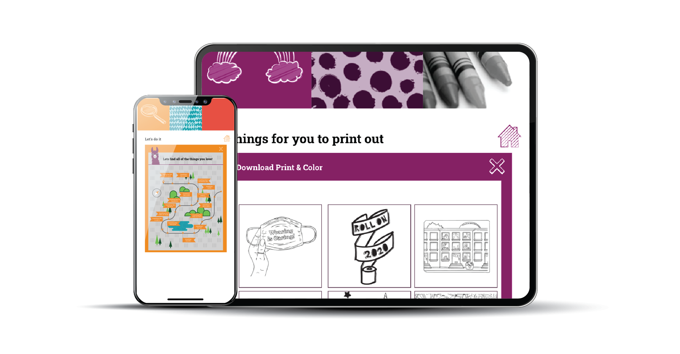
Litty Llama provided fun activities for kids throughout the COVID-19 quarantine. I drew inspiration from my lifelong love of llamas and a desire to spark joy during a challenging time. The project allowed me to design a playful character and develop wireframes, logos, digital assets, interactive elements, and kid-friendly DIY activities.
BrandPharm

BrandPharm is a web-based marketing asset management tool created to make marketing services more accessible to internal clients. The platform enabled individual users to create advertisements and marketing materials tailored to their location. All materials were designed to meet Sanford Health’s brand standards while allowing for local clinic or facility customization.
Littler Design Language System


As part of the Littler team, I helped design a language system grounded in intention rather than necessity. Centered on the core values of innovation and collaboration, the project highlighted how diverse perspectives can come together to create meaningful solutions. The branding campaign visually brought this concept to life, showing how aligned elements amplify the light of innovation.
Corporate Photography Direction


To elevate our online presence, we created a brand experience that visually put our clients first. I defined the photography style and directed the photo shoots to bring the concept to life, using motion and color to express energy and purpose. Full-color, still images highlighted our clients with clarity and focus, while black-and-white, dynamic shots of our team reflected the dedication driving our work behind the scenes. The result was a cohesive visual narrative that embodies our client-first philosophy and the effort behind every success.
Littler European Employer Event
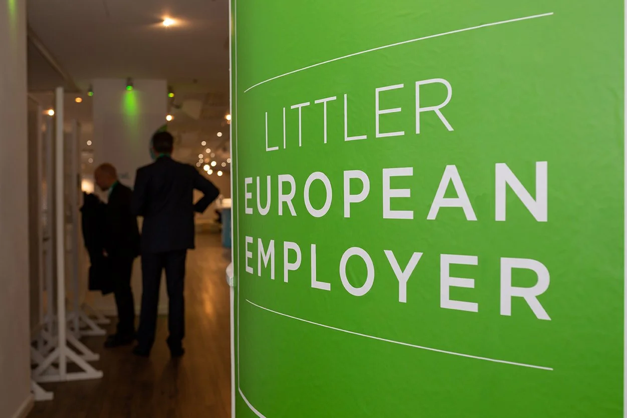
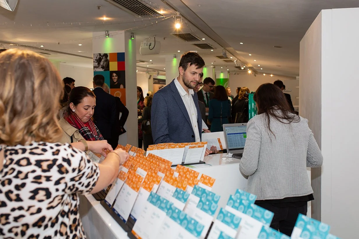
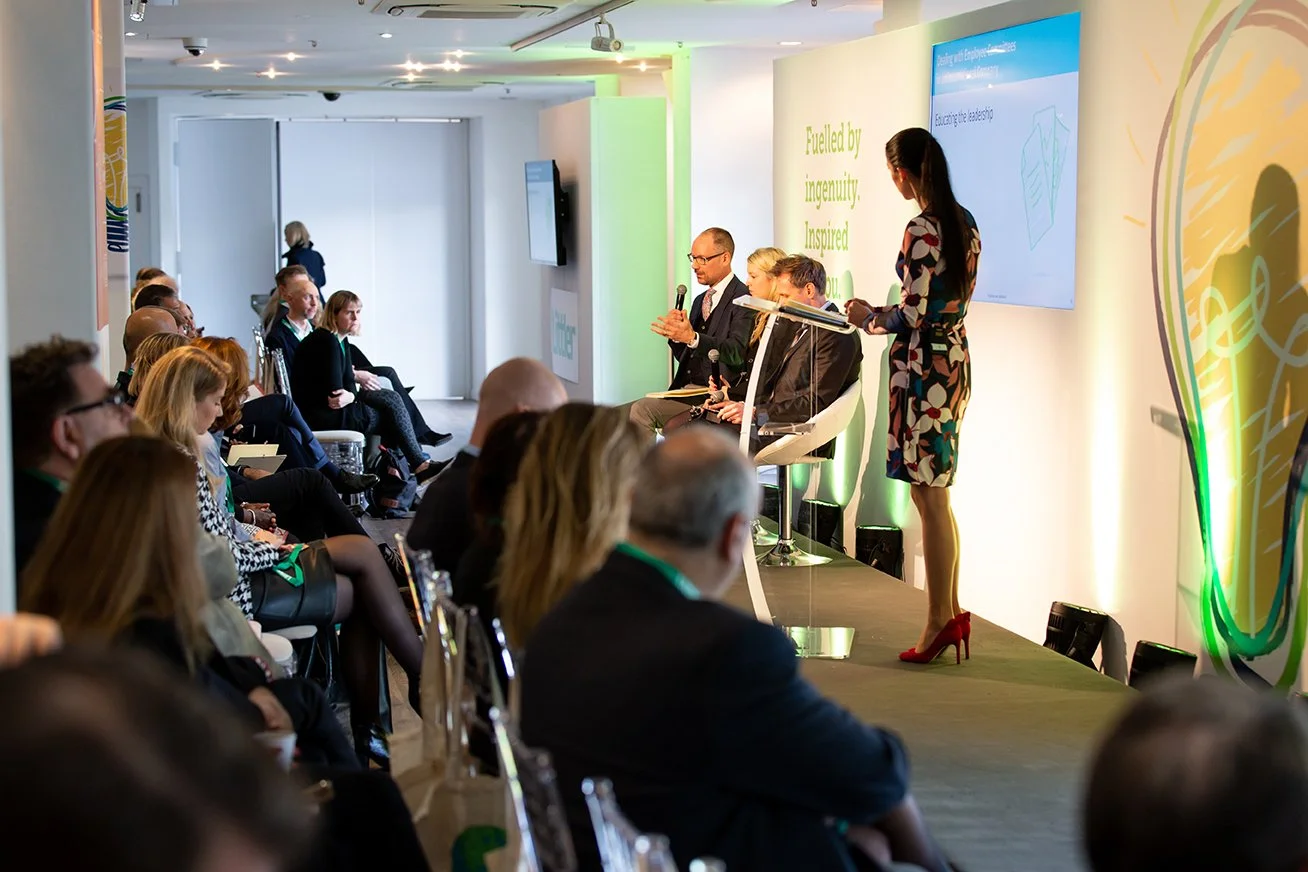
As Littler expanded its global legal practice, I led the branding for the first large-scale Global Executive Employer Conference at London’s Oxo Tower. The event delivered critical legal updates to global employers, and I designed large-format graphics for curved walls, the stage, presentations, and other key touchpoints, creating a cohesive and visually impactful experience.
MP Butterworth & Associates
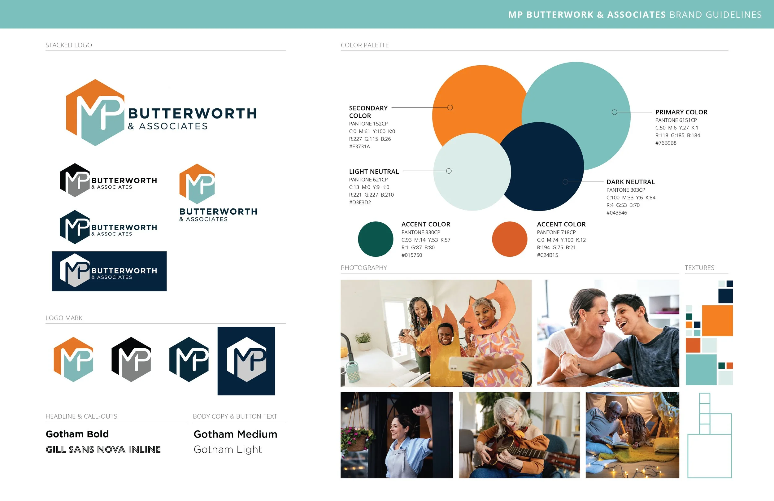
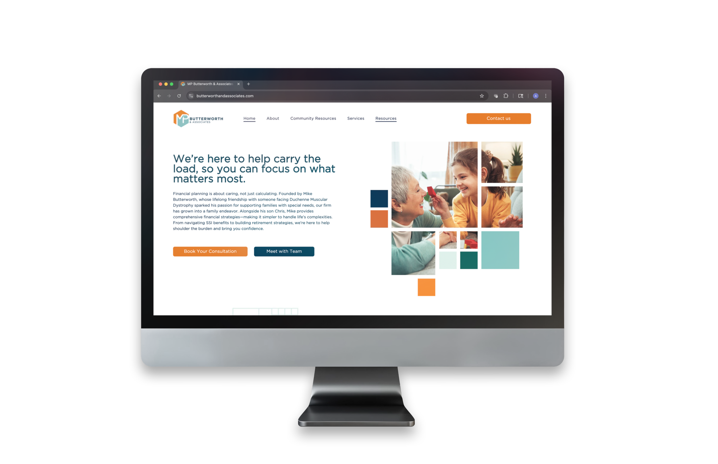

I had the absolute pleasure of collaborating with MP Butterworth on their rebrand. Their specialized approach to financial planning for families with special needs called for a distinct identity that stands apart in their industry. Soft yet confident colors, approachable typography, and heartfelt messaging reflect their mission to simplify complex financial decisions while treating every client like family, with empathy, expertise, and unwavering support. The stacking block motif symbolizes the process of building a secure future and retiring with confidence on top.
London Incentive Trip

CreativeOne hosts an annual incentive trip for its top clients to celebrate their achievements and share insights on the year ahead. These week-long events are uniquely branded to reflect each destination. For the London trip, I drew inspiration from the colors of the Union Jack and the iconography of the London Underground. This aesthetic provided a versatile foundation for elegant invitations and event materials that captured the sophistication and spirit of London’s culture.